The Shape of You and Your Brand: The Art of Choosing Your Logo Style.
Let’s be honest - when Ed Sheeran sang “I’m in love with the shape of you,” he probably wasn’t talking about logos. But he could have been. Because just like your favourite song, the right logo hits all the right notes - it’s catchy, unforgettable and gives people all the feels about your brand.
A logo isn’t just a doodle or a decorative tag on your business card - it’s the first impression, the visual handshake between a brand and its audience. And just like there are different ways to fall in love, there are different types of logos that define your brand’s identity.
Here’s your guide to the 7 distinct logo styles that make brands sing - and how to find the one that fits your brand’s rhythm.
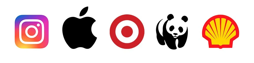
1. Pictorial.
This logo is pure visual poetry - no words, just a simple, striking image that says it all. Pictorial logos work best when your brand is recognisable enough that people can identify you from your symbol alone. (If your audience can spot you from across the room like your crush in a crowded bar, you’re doing it right.)
Why it works: It’s timeless, minimal and packs serious emotional punch.
Perfect for: Established brands, app icons, lifestyle companies - or anyone who wants to be instantly recognisable with one glance.
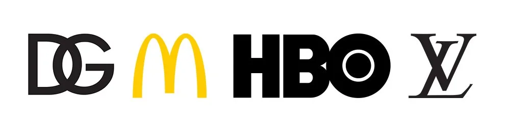
2. Lettermark.
When your brand name is a mouthful, abbreviate it with style. Lettermarks use initials to create a sleek, modern design that’s easy to remember and looks oh-so-clean on everything from business cards to social media icons.
Why it works: It’s sharp, professional and all about making a complicated name memorable.
Perfect for: Businesses with long names (or family surnames that look like a Scrabble accident). Ideal for corporate, tech and fashion brands.
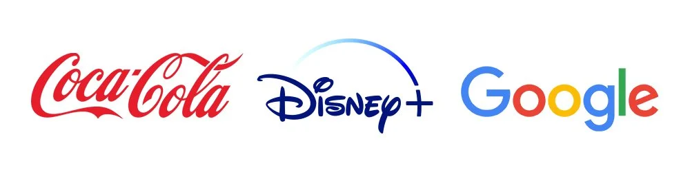
3. Wordmark.
This logo says, “I don’t need a symbol - my name is the brand.” Wordmarks rely entirely on typography and spacing to tell your story. Choose the right font and suddenly your brand is singing in perfect harmony.
Why it works: It’s bold, clear and highly flexible. Plus, it ensures everyone remembers your name, even without a visual cue.
Perfect for: Startups, personal brands, or companies with unique, catchy names that deserve the spotlight.
4. Combination.
Like Sheeran teaming up with Taylor Swift, this logo style brings together the best of both worlds - a symbol and text. The visual helps with instant recognition, while the name builds familiarity. Over time, your brand can drop the text and let the icon take center stage (just like Nike).
Why it works: It’s versatile, memorable and perfect for building brand recognition fast.
Perfect for: New businesses, rebrands or anyone who wants a logo that looks great on both billboards and coffee cups.
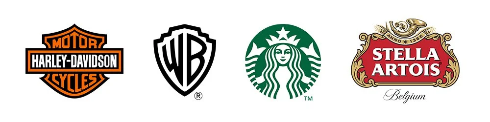
5. Emblems.
An emblem wraps your brand name inside a badge or crest, giving it a sense of tradition and prestige. It’s like the artisanal sourdough of logos - rich, layered and full of character.
Why it works: It conveys heritage, authenticity and authority.
Perfect for: Schools, cafes, breweries and brands that want to feel established or handcrafted.
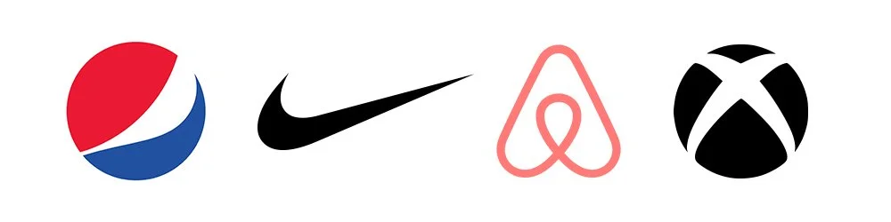
6. Abstract.
Abstract marks use geometric shapes and forms to express ideas and emotion. You may not know what the shape is, but you feel what it represents.
Why it works: It’s unique, conceptual and endlessly scalable. The shape becomes synonymous with your brand’s vibe.
Perfect for: Creative, tech or global companies that want a modern, flexible identity.
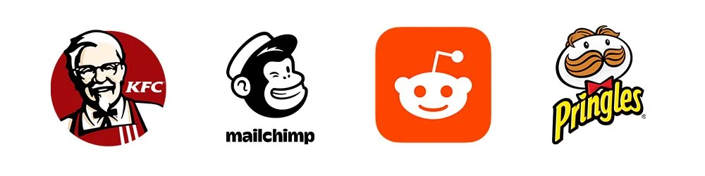
7. Mascot.
A mascot logo puts a friendly face to your brand…literally. It’s character-driven, fun and instantly memorable. You’re not just a business anymore; you’re a personality people can connect with.
Why it works: It humanises your brand and makes it approachable (especially for younger audiences).
Perfect for: Food and beverage, sports teams, kids’ products and brands that love a little playfulness.
So... What’s Your Shape?
Choosing the right logo style for your brand should be considered carefully. It’s the shape people remember, the mark they associate with your story, your tone and your personality. The right logo can whisper sophistication, shout confidence or smile playfully from a product label.
Choosing your logo style means choosing how your audience will feel when they see you. A pictorial mark might capture simplicity and modernity. An emblem might say tradition and trust. A mascot might radiate friendliness and fun. Every style has its own rhythm - and the key is finding the one that moves to the same beat as your brand.
So, take the time to shape your identity with intention. Whether you’re creating a timeless icon, a sleek lettermark or a bold wordmark - your logo should tell your story before you even say a word. Because when it fits just right, you’ll know - your brand won’t just look good; it’ll feel like you.